There was a time when the Macintosh and I shared a worldview. Not an aesthetic — a worldview.
Classic Mac OS and early macOS were built on a simple premise: the computer should reveal itself. Menus were visible. Buttons were labeled. Controls were discoverable. The interface was opinionated without being coy.
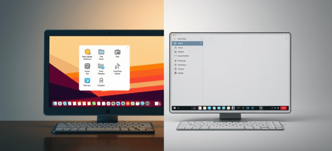
Apple put the window controls on the left, Windows put them on the right, but both systems were still speaking the same grammar. You could switch between them without feeling like you’d stepped into a parallel universe.
Somewhere along the way, that changed.
And that’s why I’m shifting away from the Macintosh. Not because it’s bad. Not because it’s slow. Not because I’ve suddenly become a Windows evangelist.
I’m leaving because the Mac no longer speaks the cognitive language my brain is built for.
Apple’s modern design philosophy is minimalism taken to the point of mysticism. Controls disappear until summoned. Menus collapse into icons that don’t explain themselves. Gestures replace buttons. Formatting hides behind a paintbrush. Functionality is revealed only through exploration.
It’s elegant.
It’s annoying.
And it’s not built for neurodivergent cognition.
My brain thrives on:
- visible structure
- predictable controls
- explicit affordances
- stable pathways
- externalized clarity
Apple’s modern UI thrives on:
- invisibility
- gesture‑based discovery
- compressed meaning
- aesthetic minimalism
- “you’ll figure it out” energy
We are no longer aligned.
Nothing made this clearer than opening Pages on my iPad.
I wasn’t confused. I wasn’t overwhelmed. I was uninvited.
The interface didn’t greet me with tools; it greeted me with absence. A blank canvas. A paintbrush icon that hides half the app’s functionality. A formatting panel that only appears if you tap the right thing in the right way. A document model that assumes you want to design your page before you write on it.
Numbers is even more revealing. It doesn’t give you a spreadsheet. It gives you a canvas and asks you to place tables on it like decorative objects. It’s beautiful, but it’s also cognitively expensive. I don’t want to arrange my data like furniture. I want a grid. I want structure. I want the thing to behave like a spreadsheet instead of a mood board.
Keynote is the most polished of the three, but even there, the assumption is that you’ll intuit your way through animations and transitions. It’s a tool built for people who enjoy discovering features by accident. I am not one of those people.
And this is where the friction becomes undeniable. iWork isn’t bad software. It’s elegant software built for a user who is not me. It’s designed for someone who finds joy in hidden controls, gesture‑based discovery, and interfaces that disappear until summoned. My neurodivergent brain doesn’t work that way. I don’t want to coax my tools into revealing themselves. I want them to show up.
The irony is that the older versions of these apps — the ones that ran on PowerPC and early Intel Macs — were more usable to me than the modern ones. They were simpler, yes, but they were also more honest. They didn’t hide the map. They didn’t treat clarity as clutter. They didn’t assume I wanted the interface to vanish.
Which brings me back to the Quadra.
There’s one thing — and only one thing — that keeps pulling me back to the Macintosh: Helvetica. Not the hardware, not the ecosystem, not the apps. Helvetica. The typeface that made the Mac feel like a studio instead of a computer. The typeface that still feels like home in a way no other platform has ever replicated.
And here’s the part that tells the whole story: I would gladly use a Quadra — a literal 68k relic — over a modern Apple Silicon machine if I could still email myself PDFs. That’s how far the philosophical drift has gone.
Those old Macs weren’t powerful. They weren’t fast. They weren’t even particularly stable. But they were honest. They revealed themselves. They didn’t hide the map. They didn’t treat discoverability as a puzzle. They didn’t assume I wanted the interface to disappear. They assumed I wanted to use it.
Modern macOS is beautiful, but it’s beautiful in the way a gallery is beautiful: curated, minimal, and slightly hostile to touch. It’s a system that assumes you want the interface to vanish, when what I actually want is for the interface to collaborate.
And that’s why my daily computing life has quietly reorganized itself around two machines that do speak my language: a Windows laptop and a Linux desktop.
Windows is not elegant, but it is explicit. It shows its seams. It reveals its tools. It gives me a ribbon instead of a riddle. It may not be pretty, but it respects my need for visible structure.
Linux, meanwhile, is the opposite of Apple’s opacity. It is configurable, transparent, and honest about what it is doing. It doesn’t hide the map — it hands me the map, the compass, and the source code. My Linux desktop is where I think. My Windows laptop is where I produce. Both systems reveal themselves in ways the modern Mac no longer does.
Helvetica is the last thread tying me to the platform — a typographic umbilical cord to a version of the Mac that no longer exists. And even that thread is fraying, because the environment around it has changed so much that the typeface alone can’t carry the weight of the relationship anymore.
When the only thing keeping you on a platform is a font, and even the software built around that typeface no longer respects the way your mind works, the platform has already lost you.
Platforms evolve. People evolve. Sometimes they evolve in different directions.
Scored by Copilot. Conducted by Leslie Lanagan.

