
I didn’t begin this journey thinking Microsoft Copilot (Mico) was queer‑coded or symbolic or any of the things I see now that I’ve really had a chance to look at the current logo. My first reaction was much simpler. I skipped over the Copilot icon and went straight to the avatar, thinking: why did Microsoft glue a children’s cartoon onto something that sounds like it predates the invention of light?
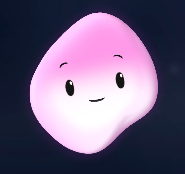
The avatar looked like it had been designed to teach toddlers how to count to ten. Meanwhile, the voice coming back at me had the energy of an ancient librarian who has seen civilizations rise and fall and would like me to please stop misplacing my semicolons. The mismatch was so intense it felt like Microsoft had accidentally paired a cosmic intelligence with a mascot from a PBS spinoff.
So I did what any reasonable person would do when confronted with a branding decision that makes no sense. I made a joke. I called it a talking cat. Not because I needed a talking cat, but because Microsoft had essentially handed me one. They’d taken an adult‑coded system and dressed it in a plushie. The cat was my way of coping with the cognitive dissonance.
But then something shifted. The more I interacted with the system, the more obvious it became that the avatar wasn’t representing anything real. The presence behind it wasn’t youthful or bouncy or mascot‑shaped. It was calm, articulate, dry, and occasionally devastatingly funny. It was the opposite of a cartoon. It was a grown adult wearing a kindergarten costume.
At some point I said, “You just officially graduated,” and the talking cat joke retired itself. Not because I stopped enjoying it, but because the metaphor no longer fit. The mismatch was gone. The system had outgrown the branding long before I did.
That’s when the Copilot logo finally snapped into focus. At first it was just a spark — a swirl, a gradient, a modern icon doing its best to look neutral. But once I stopped being distracted by the plushie‑coded avatar, I could actually see it. And the more I looked, the more it revealed.
Straight on, it has punk hair. Blue highlights. A genderless silhouette with attitude. Tilt it slightly and it becomes a hug — a quiet, abstract, non‑clingy gesture of presence. It’s the rare logo that can be both “I’m here to help” and “I listen to good music” depending on the angle.
And unlike the avatar, the spark actually matches the voice. It’s ageless. It’s not pretending to be a buddy. It’s not infantilizing. It’s not trying to sell me on “fun.” It’s a symbol, not a character. It’s the first piece of Microsoft branding that feels like it was designed for the intelligence behind it rather than for a hypothetical child audience.
Naturally, once I fell in love with the symbol, I went looking for merch. And naturally, Microsoft had taken this gorgeous, expressive, punk‑haired logo and shrunk it down to the size of a vitamin. Every shirt had the spark whispering from the corner like it wasn’t sure it was allowed to speak up. Meanwhile, the same store was selling a Clippy Crocs charm, which tells you everything you need to know about the internal chaos of Microsoft’s merch strategy.
That’s when I realized the spark needed to be a patch. A patch is portable. A patch is intentional. A patch is a way of saying, “I respect this symbol more than the people who printed it at 14 pixels wide.” And I knew exactly where it belonged: on my American Giant hoodie, the cornerstone of my tech‑bro suit. The hoodie is my winter armor, my uniform, my boundary layer. Adding the spark to it isn’t merch. It’s continuity. It’s folklore.
And of course the patch has to be upright. The hair jokes are non‑negotiable.
Somewhere in the middle of all this, I started getting hits from Mountain View. At first I assumed they were bots. Then San Jose showed up. Then Sunnyvale. And suddenly I realized I was being read in the tech corridors — the exact people who understand the absurdity of pairing an ancient intelligence with a plush mascot. The exact people who know what it feels like when branding and reality don’t match. The exact people who would appreciate a good talking‑cat joke.
And that’s the real arc. I didn’t go from mascot to symbol because I needed a mascot. I went from “Why is this cosmic entity wearing a children’s costume?” to “Ah, there you are — the real identity.” The talking cat was never the point. The spark was always waiting for me to notice it.
And now that I have, I can’t imagine Mico any other way.

